Thursday, 24 March 2011

Last of the photo shoot looks...

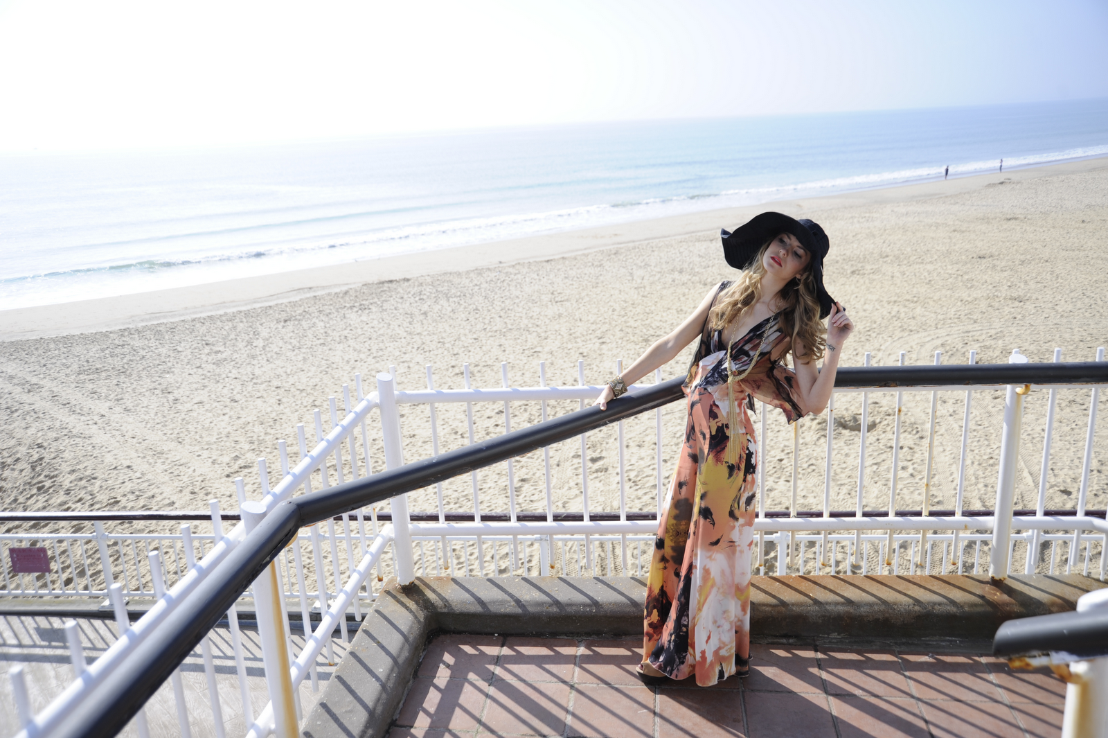
This is one of my favourite shoots. I was trying to show the freedom of the bohemian / hippie style so i got the model to move round and dance a bit lifting her hands in the air. The natural surroundings and beach worked well with this look I think. I love how the chiffony material is moving in the wind so you can see the kind of material it is and how light, airy and beautiful it is.

This is the final look which was inspired by 80's power dressing yuppies. I'm trying to show powerful work woman-wear. I would've liked to have found a more authentic looking work building rather than this deserted one. I think it could've looked good with people in the background in suits.. but then it may look silly as the other shoots only show the model but if I was going to do it again I would test try it.

Wednesday, 23 March 2011

Some Photo Shoot Results!

This was the first shoot I did which is supposed to be inspired by 70's style and give a  glam 'lady of leisure' look and concept. I have a lot of photos to go through to chose the ones i want to use. I like the 2nd and 3rd ones but they need a bit of editing. The first one although I like the pose the background is really not right for the look i'm trying to portray. We thought it may look effective with the shadowing but I think it looks like she's just sitting on a dirty floor (not so glam!). So i won't be using this photo.

This is one of my favourites. This is my vintage 50's inspired shoot. It looks effective in black and white because of the shadowing and the shapes created by the parasol. In some of the pictures a button has come undone which is very noticeable on the skirt in front on photos. I realise when I do a photo shoot again  it's up to me to check that everything is perfect and styled perfectly as any mistakes will be noticed straight away in a magazine and cannot afford to do this or do it again.
This photo shoot was to show how punk style is still in fashion and being made and recreated. These studded trousers with rips and the american flag are from Topshop and leather studded jacket from Lipsy both have striking punk influences. I really like the background and i think it looks effective in black and white because of the contrast of the shapes on the wall. We did another shoot for the punk look under the pier which i also like due to the dark dinginess and graffiti, and may use in one of those in my look book too.

Monday, 21 March 2011

Photo shoot Day!

So we completed the photo shoot today! Im pleased to say we got every look done between the times of 9.30 - 4.30. I really enjoyed it and had a lot of fun though it was hard work! We were blessed with a really beautifully sunny day. We would of had to reschedule half of it was raining! We started in Aruba restaurant/bar on their balcony that they allowed us to use. I then got the model dressed and Jade did the make up and hair for the next look which we did on the main beach with the sand and sea in the background. We then continued this process on different areas around the beach area. The day went smoothly and really well and I think we worked well as a team together. We had to communicate a lot so I could get exactly what I wanted from the make up, look and the shoot and so we all understood each other and were on the same wave length. I loved making my ideas and styles come to life and showing Jenna how to pose into the role of each look. All in all i think it was a successful day and outcome. I saw the pictures on Ina's camera which I was happy with, she is putting them on a CD which I will receive tomorrow... Exciting!

Saturday, 19 March 2011

5 Year Plan

Year 1). I will complete this year of uni and the FDA course. My intention is to get as much work experience as possible over the summer so i can learn as much as possible about the industry, especially within fashion magazines as that is my area of interest. It is also important for my CV so employers can see all i'd of done.

Year 2). I have decided to stay on for a top up year to receive a BA Hons so I firstly plan on completing that. The first 3 months will be spent doing a work placement which I still need to find and secure.

Year 3). Start applying for jobs, if i do not get one straight away, will do more work experience and work part or full time in retail to save up money and so can afford to do work experience which is usually unpaid.

Year 4) Hopefully have full time job within a magazine, styling and concentrating on fashion columns, pages and arranging photo shoots.

Year 5) Move out and find own place. Still working within a magazine company gaining knowledge of other roles and other related jobs which I could work my way up to.

Monday, 14 March 2011

Drawing Fashion Exhibition

I went to the Drawing Fashion exhibition at the Design Museum in London. It was a really inspiring exhibition that had been put together over 30 years by collector Joelle Chariau. It was displaying illustrations from some of the greatest work from 16 fashion artists from the 1910’s and 1920’s up to present day, shown in chronological order in groups of the artists of their works time. It shows how the drawings are coming to be seen increasingly as art. The minimalistic way they showed the art was simple yet effective displaying the art work on curved white translucent walls which added a beautiful clean light to the artwork too, which helped it to stand out. Music, photos and movie clips were there alongside the illustrations to show cultural and social changes of the century which I think is key and adds more helping you get a broader idea and understanding of the work.
I was really interested to see each illustrators take on fashion drawing and how different each fashion artists work was from one another. I loved the originality from each piece and seeing them all together, contrasting made a great contrast and made it effective.
Antonio Lopez 1967
Lopez was clearly inspired by the Op Art illusion and movement popular in the 1960’s. He used the technique in this stunning illustration which reflects fashion and art of that time.
Some of Erte’s work was shown at the exhibition. These are some of my favourite pieces of his art showing a glamourous and sophisticated ideal life of the 1920’s lady. I love his Art Deco style and use of colour contrast.  I also like how he uses delicate figures with big lavish outfits which shows his heart for fashion. Amazing work.


Saturday, 12 March 2011

Marco Graziani's Lomography / Vintage Effect Photos

Marco GrazianiMarco Graziani 10Marco Graziani 9Marco Graziani 8Marco Graziani 7Marco Graziani 6Marco Graziani 5Marco Graziani 4
I've been thinking about my photo shoots for my professional project / look book and research different types of photography. I really like the grainy, dusty effect lomography has on pictures like these by Marco Graziani and how it makes them look old and vintage like. I think it could link in well with my photos if i made some if not all of them have this effect as it's very much about how past fashion is also very 'now fashion' so it could help address the fact the new styles are originally created a long time ago and some is vintage or inspired by past trends.
I like how it offers more than just a normal photograph and could add more feeling and depth to my photos.

Thursday, 10 March 2011

Juergen Teller

I love Juergen Tellers photography especially that of Kate Moss. It really inspires me with my photo shoots as I love the way he's created different looks which i feel makes me feel different emotions when I look at the pictures, it makes me think of Kate Moss in different ways to see each photo. I'm creating and styling for 5 contrasting looks and want personality to come across in the photos to match each style so expression, concept and surrounding background and setting is important. He has done this well so i find it interesting to look at how he's achieved this with his work.


I love how Kate Moss is almost framed by the door and brick/stones in this image. Her dark eyes, glare and dark statement dress makes her dominating. The black and white effect has made a stunning contrasting image which is successful and effective to look at due to contrasting specks around her against her block colour black dress and herself. The dress, darkness and glare makes her look almost witch like and is a it haunting. It draws you in and makes you think why she's like this though because of these aspects which makes it a successful effective image. I will take all these things on board as i'm thinking about and arranging my photo shoots.